This is a summary of the recent performance of a wide range of excellent Tactical Asset Allocation (TAA) strategies, net of transaction costs. These strategies are sourced from books, academic papers, and other publications. While we don’t (yet) include every published TAA model, these strategies are broadly representative of the TAA space. Learn more about what we do or let AllocateSmartly help you follow these strategies in near real-time.
Commentary:
 It was boom or bust for TAA in May. The good news is that 2 out of 3 strategies outperformed the benchmark for the month. The bad news is that those that underperformed did so badly, with a dozen or so strategies 100% long risk assets into the void [insert here our standard reminder about the importance of diversifying across strategies – a problem our site was specifically built to solve].
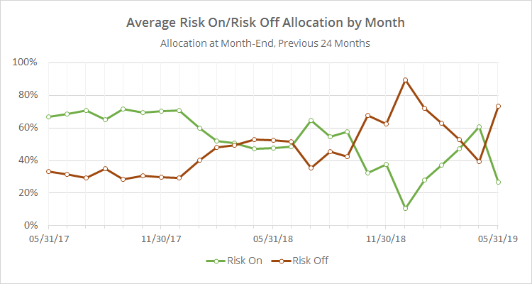
As expected, TAA has significantly increased exposure to defensive assets in response to the market weakness. As we show in the data dump below, the increase in defensive exposure was the second largest one month increase since 2000. TAA should be well positioned should the market continue to falter in June.
TAA continues to trail for the year. As we’ve been covering throughout the year, TAA successfully sidestepped the downturn in late 2018, but entered the new year positioned too defensively for the market recovery and has yet to catch up.
To some degree, this is the price of doing business for trend-following/momentum types of strategies. At some point, TAA’s cautious nature is going to save the portfolio from significant loss (ex. 2000-02 and 2007-08), but in the meantime, that risk adversity makes TAA prone to getting stuck on the sidelines when those losses don’t develop.
Data Dump:
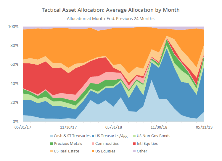
With such a large pool of published strategies to draw on (49 and counting), we’re able to draw some broad conclusions about the state of TAA. The following two charts help to show trends in the asset classes that TAA as a whole is allocating to over time.
The first chart shows the average month-end allocation to categories of assets by all of the strategies that we track. For example, “US Equities” may include everything from the S&P 500 to individual stock market sectors. Defensive assets tend to be at the bottom of the chart, and offensive at the top. The data on the far right of the chart reflects where TAA stood as of the end of the most recent month.
The biggest shift in allocation was out of US equities (-26%) and international equities (-7%), and into US Treasuries (+24%) and cash (+7%).
In the second chart below, we’ve combined average TAA allocation into even broader categories: “risk on” (equities, real estate and high yield bonds) versus “risk off” (everything else). We realize that some asset classes don’t fit neatly into these buckets, but it makes for a useful high level view. Note the significant increase in exposure to defensive assets (click for a longer view).
We invite you to become a member for about a $1 a day, or take our platform for a test drive with a free limited membership. Put the industry’s best tactical asset allocation strategies to the test, combine them into your own custom portfolio, and then track them in near real-time. Have questions? Learn more about what we do, check out our FAQs or contact us.

