This is a quick analysis of the “Lazy Man’s Momentum Strategy”, a simple country rotation strategy. Every six months the strategy selects from 22 country indices, buying the 11 with the highest 6-month return (*). For reasons we discuss in a bit, we will not be adding this strategy to our platform.
Backtested results from 1971 follow. Results are net of transaction costs – see backtest assumptions. Learn about what we do and follow 90+ asset allocation strategies like this one in near real-time.
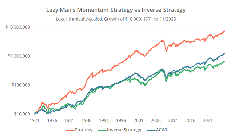
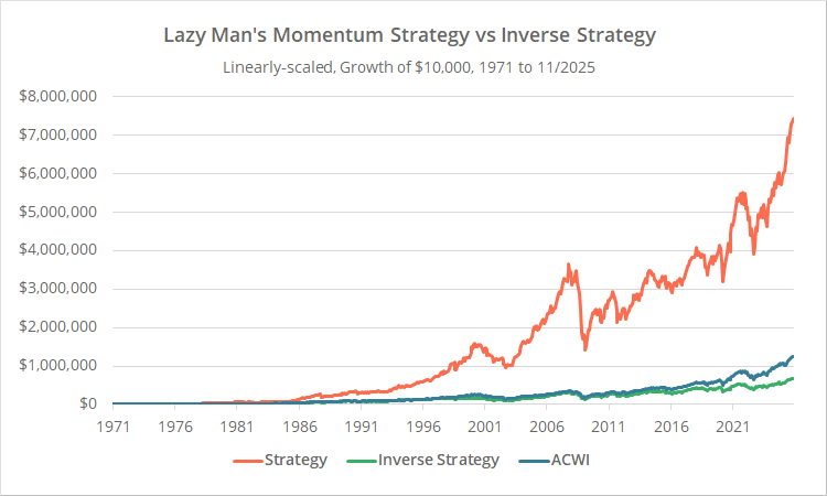
Logarithmically-scaled. Click for linearly-scaled results.
We show results in two flavors. In orange, we show the strategy as designed. And for comparison, in green we show the inverse strategy, i.e. holding the 11 countries with the lowest 6-month return.
Our benchmark is the All-Country World Index (ETF: ACWI). It’s not a perfect match for the 22 countries traded by the strategy, but it’s close enough for the purpose of this analysis.
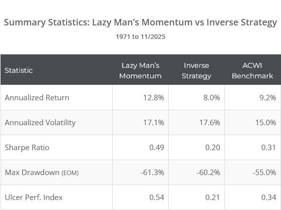
At first glance, the strategy looks effective. Over the entire test, the strategy has significantly outperformed the benchmark and the inverse strategy, both in terms of return and risk-adjusted return (Sharpe and UPI).
Why isn’t the benchmark ACWI closer to the center of the two versions of the strategy? After all, at all times one of the two strategy versions is holding nearly all of the countries in ACWI.
The main reason is that ACWI is a cap-weighted index. For example, the US currently makes up 63% of holdings, while New Zealand makes up just 0.05%. This strategy strips away that cap weighting. Allocation to each country is equal. The fact that even the inverse strategy almost matches the benchmark shows that much of the strategy’s outperformance has come from this equal weighting (and not momentum) (*).
Why the “Lazy Man’s Momentum Strategy” is a non-starter:
Below we’ve shown the relative performance of the strategy versus the inverse strategy. Put another way, this is the strategy equity curve from the first chart above (orange line) divided by the inverse equity curve (green line).
When relative performance is rising, the strategy is outperforming, and when it’s falling, the inverse strategy is outperforming. When it’s flat, it means the strategy is no more predictive than a coin flip.
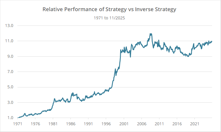
These results paint a much different picture than our earlier 30,000 foot view results. Since mid-2000, relative performance has been flat, meaning the strategy has been no more predictive of future returns than its inverse. It’s always difficult to know when a strategy has become ineffective, but we’re confident that 25 years is long enough to call it.
This isn’t a debunking of momentum in general. Absolute momentum has done very well since 2000. So, for example, these results might have been very different if the strategy rules were instead “pick the 11 country indices with the highest 6-month return, but if the 6-month return was negative, allocate that portion of the portfolio to cash.”
However, pure relative momentum as it’s defined here (selecting the highest momentum, regardless of whether it is negative), has not been effective at trading country indices over the last 25 years.
This illustrates the importance of not just looking at long-term summary stats, which can be skewed by success early in the backtest, but also how performance has evolved over time.
New here?
We invite you to become a member for about a $1 a day, or take our platform for a test drive with a free membership. Put the industry’s best Tactical Asset Allocation strategies to the test, combine them into your own custom portfolio, and follow them in real-time. Learn more about what we do.

* * *
Geek notes:
(1) This strategy only trades twice per year, at the end of Dec and Jun. That’s an obvious opportunity for overfitting. What if we instead traded just one month later, at the end of Jan and Jul? It would change the entire track record, despite having no practical significance.
In response we tested a “tranched” version of the strategy, trading 1/6 of the portfolio at the end of Dec and Jun, 1/6 at the end of Jan and Jul, etc. We didn’t show the results here because they are essentially identical; our concerns were unfounded. In the real world, we would still prefer a tranched approach, but it didn’t lead to a significant difference in historical results.
(2) As mentioned, much of the strategy’s outperformance came from the equal-weighting of country indices. Equal-weighting (as opposed to cap-weighting) worked well over most of the period tested, but note that equal-weighting would have been a terrible idea since 2008. That’s mostly due to the outperformance of the US, especially relative to European countries, which make up most of the 22 country indices covered by this strategy.