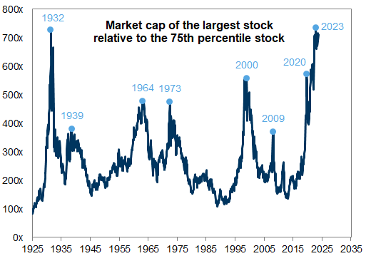
This paper from Goldman Sachs made big headlines a couple of months back for forecasting an abysmal 3% nominal annual return for US stocks in the coming decade. For anyone who didn’t read GS’s analysis, the biggest contributor to that poor return was “market concentration”, or the market cap of the largest stocks relative to the remainder of the stock market.
They provided the following graph showing how market concentration has peaked prior to previous market downturns, and how our current market concentration has reached levels not seen since the Great Depression. We strongly suspect this is bad data. Let’s talk about it.
The footnote of GS’ graph reads: “Series prior to 1985 estimated based on data from the Kenneth French data library, sourced from CRSP, reflecting the market cap distribution of NYSE stocks.”
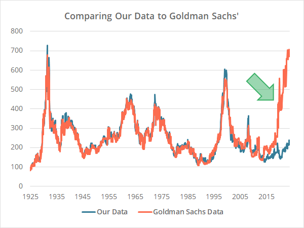
After a bit of trial and error, we worked out how GS likely used Dr. French’s data to produce most of that graph (methodology follows later in this analysis). Below we compare our estimate (blue) versus a best guess at the data in GS’ graph which we extracted using automeris.io (orange).
Our data lines up very closely to GS’ prior to 2019. We suspect it would be a near perfect fit if we had GS’ actual data rather than a visual estimate.
Now look at the stark difference post-2019 marked with the green arrow. We show a most recent market concentration of 216x. Goldman Sachs? 700x. Not even in the ballpark.
It appears that GS changed their recent methodology for calculating market concentration. If that’s true, GS is drawing conclusions about what constitutes “high concentration” by comparing today’s value to a non-representative history. Put more simply, GS is comparing apples to oranges.
How we created our estimate of market concentration:
GS stated in the footnote of their graph that prior to 1985, they used data from Dr. Kenneth French, but they did not specify how they transformed that data to calculate market concentration.
We used Dr. French’s data library (“ME Breakpoints”) for our entire estimate. For each monthly value, we divided the 20th vigintile (100th percentile) by the 10th vigintile (50th percentile). The 75th percentile, as GS’ graph claimed, was not used, and would have yielded very different results.
Our best guess is…
- For data prior to 1985, GS used Dr. French’s data in the exact same way we have.
- Beginning in 1985, GS switched to a new methodology that resulted in essentially the same result as their French-derived data, which is why our estimate still matches very closely.
- For 2019 and beyond, GS switched to a third methodology that resulted in entirely different results. For example, GFD shows a unique history of market concentration based on the top 1, 5 or 10 companies (instead of the top vigintile). Perhaps GS stitched in data like this.
Why this matters:
If all of the above is true, then GS is drawing conclusions about what constitutes “high concentration” by comparing today’s value to a non-representative history
If our measure of market concentration – the one that we suspect GS used for most of their data history – is the most predictive of future returns, then we’re currently at very normal concentration levels relative to the last 100 years and it should not be a factor in GS’ forecast. By GS’ own calculation, that would make their 10-year forecast 7% annually, not 3%, a huge difference.
Alternatively, if GS’ most recent methodology for calculating market concentration is the most predictive of future returns, then GS is comparing apples to oranges, and has not demonstrated that today’s levels are actually at historic highs.
No response from Goldman Sachs:
It’s possible that Dr. French’s data is wrong. We find that less likely simply because Dr. French’s methodology has been consistent, while by their own admission, GS stitched together multiple sources to create their data. We reached out to Dr. French and he confirmed that his methodology has not changed.
We also reached out to the five authors cited in GS’ analysis. We don’t expect a reply given the implications of such a massive failure in analytical rigor, but if we do we will update this analysis accordingly.
New here?
We invite you to become a member for about a $1 a day, or take our platform for a test drive with a free membership. Put the industry’s best Tactical Asset Allocation strategies to the test, combine them into your own custom portfolio, and follow them in real-time. Learn more about what we do.


