This is a summary of the recent performance of a wide range of excellent Tactical Asset Allocation (TAA) strategies, net of transaction costs. These strategies are sourced from books, academic papers, and other publications. While we don’t (yet) include every published TAA model, these strategies are broadly representative of the TAA space. Learn more about what we do or let AllocateSmartly help you follow these strategies in near real-time.
Commentary:
 TAA as a whole did not keep pace with the benchmark in April. US equities in particular turned in big returns (ex. SPY +4.1%, QQQ +5.5%), and TAA started the month with too little equity exposure to take full advantage of the run up.
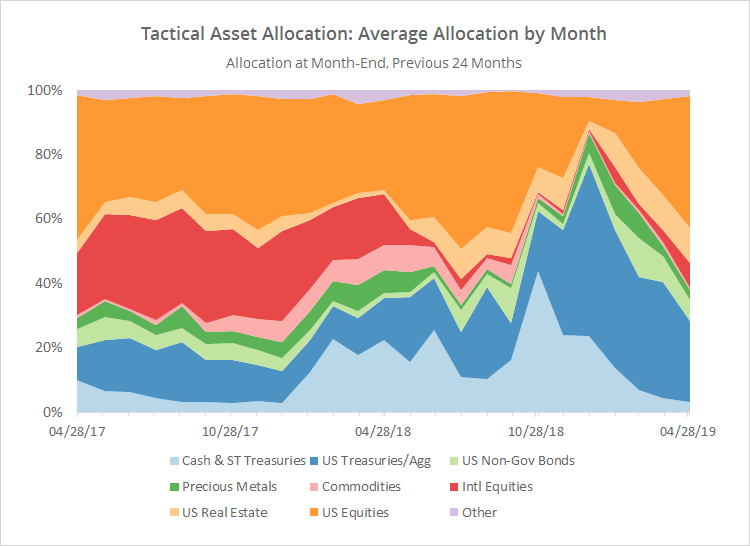
As we show in the data dump below, TAA has come full circle, returning more or less to the same asset allocation as it held just prior to the market downturn in late 2018. TAA successfully sidestepped the downturn, but entered the new year positioned too defensively for the market recovery and is currently trailing YTD.
To some degree, this is the price of doing business for trend-following/momentum types of strategies. At some point, TAA’s cautious nature is going to save the portfolio from significant loss (ex. 2000-02 and 2007-08), but in the meantime, that risk adversity makes TAA prone to getting stuck on the sidelines when those losses don’t develop.
Data Dump:
With such a large pool of published strategies to draw on (49 and counting), we’re able to draw some broad conclusions about the state of TAA. The following two charts help to show trends in the asset classes that TAA as a whole is allocating to over time.
The first chart shows the average month-end allocation to categories of assets by all of the strategies that we track. For example, “US Equities” may include everything from the S&P 500 to individual stock market sectors. Defensive assets tend to be at the bottom of the chart, and offensive at the top. The data on the far right of the chart reflects where TAA stood as of the end of the most recent month.
For the third month in a row, the biggest shift in allocation was into US equities. Year to date, US equity exposure has risen from just 7% to 41%.
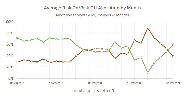
In the second chart below, we’ve combined average TAA allocation into even broader categories: “risk on” (equities, real estate and high yield bonds) versus “risk off” (everything else). We realize that some asset classes don’t fit neatly into these buckets, but it makes for a useful high level view.
Note the continued ramping down in defensive assets. Looking at the longer view, the recent brief period of extreme defensiveness looks very similar to what happened to TAA in late-2015 and early-2016. In both of those instances, TAA got “headfaked”, responding well to early market weakness, only to see the market immediately snap back.
We invite you to become a member for about a $1 a day, or take our platform for a test drive with a free limited membership. Put the industry’s best tactical asset allocation strategies to the test, combine them into your own custom portfolio, and then track them in near real-time. Have questions? Learn more about what we do, check out our FAQs or contact us.

