Edit 01/10/24: This post has been revised since initial publication. See the end notes to learn more.
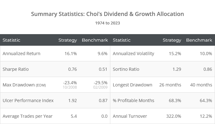
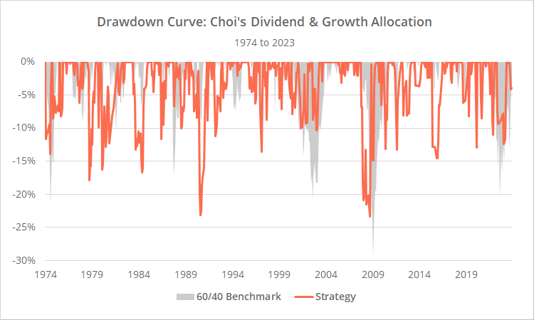
This is a test of Paul Choi’s paper Balance Between Growth and Dividend: Dividend & Growth Allocation (DGA). This strategy would have delivered exceptional performance over the last 50 years, but we would temper future expectations for several reasons we discuss below.
Backtested results from 1974 follow. Results are net of transaction costs – see backtest assumptions. Learn about what we do and follow 80+ asset allocation strategies like this one in near real-time.
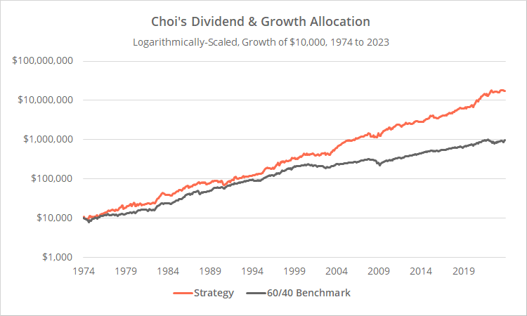
Logarithmically-scaled. Click for linearly-scaled chart.
Overview:
DGA is like Wouter Keller’s Hybrid Asset Allocation (HAA) in that it uses momentum in US TIPS (Treasury Inflation Protected Securities) to gauge the health of the market. This idea of using bond momentum in this way is something we’ve covered several times (the best example being this post).
Unlike Keller’s HAA though, when the market is “risk on” it allocates 100% of the portfolio to a risk asset (HAA may still hold a diversified portfolio when risk on). That makes it, on average, a much riskier strategy. In fact, it exhibits the highest annualized volatility (a measure of risk) of any of the 80+ strategies that we track.
DGA also considers additional market valuation measures, but we wonder how applicable these will be in the future. More on this later.
Strategy rules tested:
1. At the close on the last trading day of the month, determine whether the market is risk on or risk off based on the following 3 checks. All 3 checks must pass to be considered risk on.
- If the price of US TIPS (represented by the ETF TIP) is greater than its 12-month average.
-
If the current S&P 500 dividend yield is >= 1.6%.Dividend yield = S&P dividends per share over the trailing 12-months divided by the cash price of the S&P 500.Quarterly S&P 500 dividend data is not released in real-time, so we’ve added a 1-month lag. In other words, we’re using the most recent S&P 500 cash price, but the dividend value from the previous month.
-
If the US Treasury yield curve was, at no point between 7 and 15 months prior, inverted.Here, the yield curve is considered inverted if the 10-year UST yield is more than 0.5% below the 3-month UST yield. The 7 to 15 month delay is due to the historical lag between yield curve inversion and stock market impact.See the end notes for some additional bugaboos on this subject.
2. If risk is on, measure the momentum of both the Nasdaq 100 (QQQ) and US High Dividend Stocks (SCHD), and go 100% long the ETF with the highest momentum score at the close.
Momentum = average of each asset’s 1, 3, 6, 9 and 12-month % return
3. If risk is off, measure the momentum of three defensive assets: US short-term Treasuries (BIL), US long-term Treasuries (TLT) and commodities (PDBC). Go 100% long at the close the ETF with the highest momentum score if momentum is positive, otherwise to “cash”.
Momentum = close / 6-month average month-end close – 1
Note: As we do throughout this site, we’ve replaced all positions destined for BIL with cash.
4. Hold all positions until the last trading day of the following month.
* * *
A unique asset choice: US High Dividend Stocks (SCHD)
Note: For other ETFs that provide similar exposure to SCHD, please see the ETF Alternatives Table.
DGA is the first strategy we track that uses the “US high dividend stocks” asset class. The strategy uses two opposing equity ETFs (QQQ and SCHD) to capture whatever flavor of investing is in favor at that moment.
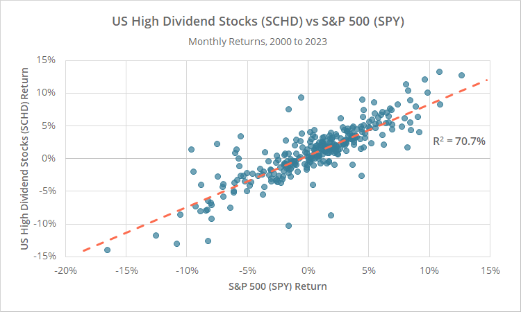
As the following graph demonstrates, SCHD has generally followed the broader market. Below we’ve shown monthly % returns for the S&P 500 (SPY, x-axis) vs SCHD (y-axis) since 2000.
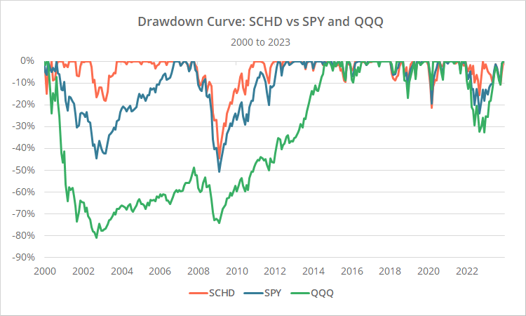
A major advantage of SCHD has come in major market downturns when it has sometimes been more resilient than SPY (and much more resilient than QQQ). An exception was the 2007-08 Global Financial Crisis.
Below we’ve shown drawdowns in all three asset classes since 2000.
For what it’s worth, this juxtaposition of QQQ and SCHD is interesting, but it was not a major contributor to performance over the long-term. The strategy would have performed similarly had we simply always held the S&P 500 (SPY) when risk on.
That may be because our results include a transaction cost assumption that inherently penalizes trading too frequently for marginal benefit.
Reasons to temper our expectations of Choi’s DGA:
DGA tests very well historically. It’s one of the top performing strategies on our platform across multiple metrics. We always try to take an adversarial position against strategies we add to the platform, and that’s 10x more true for strategies that would have performed as well as DGA.
Here are four reasons investors may want to consider tempering expectations of DGA for the future:
A. TIPS data quality:
TIPS are a key to DGA’s performance, but an actual TIPS ETF did not exist prior to late 2003, and TIPS index data does not exist prior to 1997. More so than any other asset class we cover, historical TIPS simulations should be taken with an extra-large grain of salt. They are an educated guess (read more about simulating asset class data).
As we did in our test of Keller’s Hybrid Asset Allocation, we did a sanity check looking at how the strategy would have performed if we replaced TIPS data with rock solid US Treasury data (IEF). We’ll show those results later in this post, but the key takeaway is that performance declined substantially.
Could it be that TIPS are giving us insights into the market beyond what treasuries do? Absolutely. But it’s difficult to say that conclusively with uncertain data.
B. “Stacking” successful observations:
We’ve made this critique of other strategies as well, such as Keller’s Bold Asset Allocation and Quantpedia’s TrendYCMacro.
DGA is taking a simple, straightforward concept (“bonds as predictor of future risk asset performance”) and then further and further narrowing the time in market based on other unrelated observations (i.e. the dividend yield and an inverted yield curve).
Here’s the rub: the more we “stack” historically successful observations on top of each other, the more we increase the likelihood of overfitting to the historical data. We’re building stricter and stricter definitions of when to be in or out of the market.
That’s very different than say what we do with Model Portfolios. In that case, we’re splitting the portfolio among things that have worked historically. The complexity of the individual observations is unchanged, we’re just spreading our bets across more of them.
Are we giving DGA the thumbs down? Not at all. Most of the individual observations the strategy is considering have value on their own. It’s simply a conceptual critique of this style of strategy design.
C. Dividend yield threshold is fit to recent history:
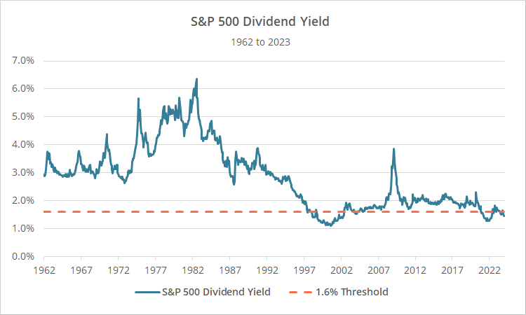
As described previously, the strategy moves to risk off assets when the S&P 500 dividend yield falls below 1.6%, because it’s an indication that the market is overvalued. But that threshold is only relevant to recent history. Below we’ve shown the dividend yield since 1962 (blue) versus the 1.6% threshold (orange):
For most of the market’s history, it came nowhere close to 1.6%. That would have been true all the way back to the 1870’s (based on Shiller’s dataset). It only fell below 1.6% in the late 1990’s. Clearly, the 1.6% threshold is fit to recent history. We would have much preferred to see a threshold that evolved over time (such as n-standard deviations below some moving average perhaps?).
Why? If some fixed threshold that indicates stocks are overvalued is only relevant to a narrow slice of market history, it gives us no confidence that the threshold will continue to be relevant in the future.
What if a dividend yield of 1% becomes the norm in the future? The strategy would remain defensive indefinitely. Or, what if the dividend yield returns to long-term norms in the 3% range? The 1.6% threshold may never be triggered again. A threshold that evolves is able to adapt to whatever the market’s new normal becomes.
On a tangentially-related note, this is why we use “walk-forward” and not “hindsight” analysis in our 10-Year Stock Market Return Forecast.
D. Adversarial test results:
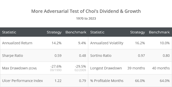
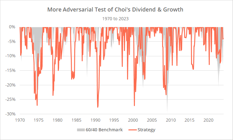
Below we’ve generated more “adversarial” results for DGA based on some of our previous critiques. What did we change?
- We replaced US TIPS with US Treasuries (IEF) prior to the launch of the actual TIP ETF. We have sufficient concern about simulating the long-term performance of TIPS to warrant looking at a worst-case alternative.
- We’ve done away with the dividend yield check altogether due to concerns that it’s a rule overly fit to recent history.
Note: these results extend back to 1970, making them 4 years longer than our initial test. We wanted to capture that big drawdown that would have peaked in 1974.
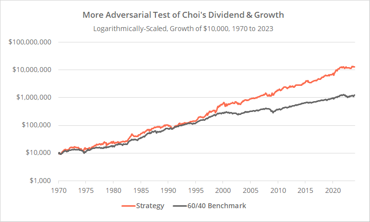
Logarithmically-scaled. Click for linearly-scaled chart.
In our more adversarial test, DGA is still an effective strategy, but less so than the original test, especially in terms of managing risk and drawdowns.
Are these results “more right”? No, they’re just an indication that we may need to temper expectations of DGA for the future.
In short:
Interesting strategy. Effective core idea. Extremely volatile – even more so than the “straight” historical results might indicate – so use appropriate caution and combine with other strategies in a Model Portfolio. The dividend yield portion of the strategy might be an issue in the future and investors should consider how relevant the 1.6% threshold is moving forward.
A big thank you to Paul for inviting us to review his paper. I know that the community appreciates it and looks forward to his future work.
New here?
We invite you to become a member for about a $1 a day, or take our platform for a test drive with a free membership. Put the industry’s best Tactical Asset Allocation strategies to the test, combine them into your own custom portfolio, and follow them in real-time. Learn more about what we do.
* * *
Edit 01/10/24: This post was revised after initial publication. Why? We were requested to review this strategy back on 11/30/23 and first downloaded the paper around that time. The author revised the paper on SSRN on 01/03/24 (last week), and we were not made aware of that revision.
There was a key difference in the author’s revision that we had not accounted for, a change in what constitutes an “inverted yield curve” (the 10y UST yield must be at least 0.5% below the 3m yield, not simply below it by any amount).
As part of working through that revision, we discovered another difference between our results that should have been minor, but was having an outsized impact. The authors used a very specific index to measure the spread between 10y and 3m UST yields, the monthly FRED series T10Y3MM.
In the case of other strategies we track, we would calculate the spread ourselves based on the underlying yield data. But when we instead used the author’s preferred series (T10Y3MM) it had a significant impact on our results.
Why? In short, this aspect of the strategy is very “fragile” and prone to overfitting. A single monthly data point could impact 9 other months (because of the 7-15 month lag). Making things worse, the strategy allocates 100% to a single asset, so any difference in allocation likely has a significant effect.
Here’s the problem with that series: according to FRED, the way in which T10Y3MM is calculated changed in June, 2019. After that date, we’re able to replicate that data series using underlying yield data fairly closely. Prior to that date, we drift further and further away from the FRED results. In other words, we don’t know how this older data is derived, but we know it differs from the newer data.
When replicating strategies we endeavor to make them as relevant to an investor trading today as possible. That’s why, for example, we use a transaction cost assumption more inline with today’s market rather than much higher transaction costs of 50 years ago.
If that older T10Y3MM data is not relevant to today’s market, we don’t feel comfortable using it. So, for all dates prior to June 2019, we calculate the spread ourselves. For all dates on and after June 2019, we use the FRED series.
That decision had a negative impact on historical results, but we think it makes for a more accurate analysis. We can’t eat backtested returns.
