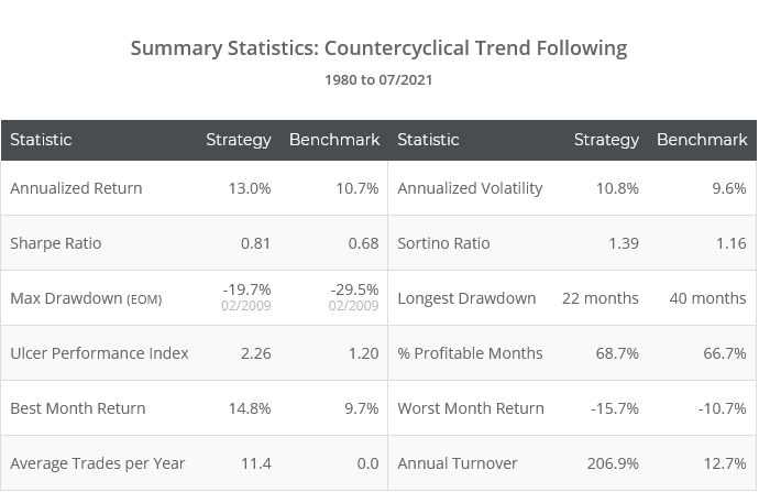
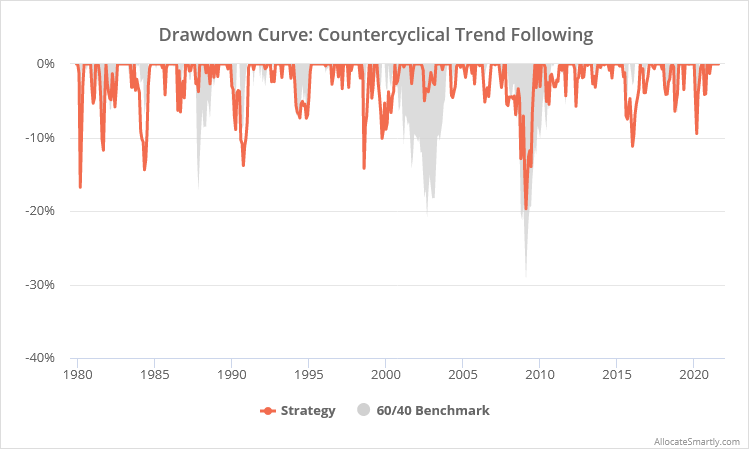
This is a test of a tactical strategy based on contrarian timing of the business cycle, increasing risk during periods of stress and decreasing risk during periods of calm. The strategy adds trend-following to this countercyclical approach to manage short-term market shocks.
Backtested results from 1980 follow. Results are net of transaction costs – see backtest assumptions. Learn about what we do and follow 60+ asset allocation strategies like this one in near real-time.
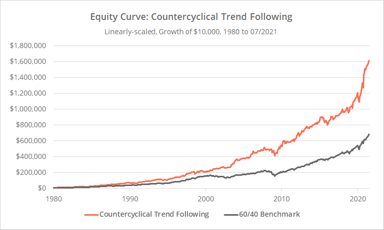
Linearly-scaled. Click for logarithmically-scaled chart.
A strange origin story:
Bit of a weird one here. There’s a paper that’s gained some popularity recently that a number of members have asked us to replicate. The paper is vague on some specifics, so we reached out to the authors multiple times over the last few weeks for clarification to no avail.
We aim to spread good vibes, so we’re going to withhold the name of the authors here. Any future requests for our thoughts on the strategy will be referred to this post.
We can’t say for sure that we’ve replicated the strategy precisely, but we have captured the spirit of the strategy. When we use the same overly optimistic assumptions made by the authors (including data sources, lack of transaction costs, etc.) we match their results very closely. More on this is a moment. The results presented here are based on our more conservative assumptions.
Strategy rules tested:
This description is going to feel like a word salad (would have been nice to link to the authors’ paper for clarity), but it’s really pretty straight forward: We determine the state of the business cycle at month-end, which determines the portfolio for the following month. For positions in SPY and GLD, we use simple trend following to move in and out of positions throughout the month.
Our first task is to determine the state of the business cycle using two oft cited economic data points:
- High Yield Spread: The difference in yield between sub-investment grade corporate bonds and corresponding US Treasuries (1). When the high yield spread is wide it’s seen as a sign of market stress, as it indicates higher perceived risk of investing in riskier companies.
- Slope of the Treasury Yield Curve: The difference in yield between 10-year and 1-year US Treasuries (CM). Conventional wisdom says that a flat/inverted yield curve portends economic weakness and/or inflation.
At the close on the last day of the month, we compare each of our economic indicators to their respective median values from the trailing 10-years. We include a generous 2-day lag for the current reading to ensure there are no issues acquiring data (this had a slightly positive impact on results).
- If the High Yield Spread is above its trailing 10-year median, the market is in a “Growth” state (remember: it’s contrarian). Disregard the Slope of the Yield Curve.
- If the High Yield Spread is below its trailing 10-year median, refer to the Slope of the Yield Curve. If the slope is below its 10-year median, the market is in an “Inflation” state. If it’s above, the market is in a “Slowdown” state.
The current economic state applies to today, and all days until the close of the following month.
We are unclear whether the authors intended to determine the state of the business cycle on a daily basis, but when transaction costs are considered, doing so just once per month outperforms. Note: Even though the economic state is determined monthly, the strategy could potentially trade on any given day based on the trend-following component of the strategy. More on this in a moment.
Each of the three economic states trades a different portfolio optimized to that state:
- Growth (HY Spread wide):
- 50% US Large Caps (represented by SPY), with trend-following
- 40% US Small Cap Value (IWN)
- 10% Gold (GLD), with trend-following
- Inflation (HY Spread narrow and Slope of Yield Curve flat):
- 50% US Large Caps (SPY), with trend-following
- 10% US Small Cap Value (IWN)
- 40% Gold (GLD), with trend-following
- Slowdown (HY Spread narrow and Slope of Yield Curve steep)
- 50% US corporate bonds (LQD)
- 40% Intermediate-term US Treasuries (IEF)
- 10% US Small Cap Value (IWN)
Without the trend-following component of the strategy, we would simply execute each portfolio on the last day of each month. For all positions in SPY and GLD however, some simple trend-following is applied to protect against market shocks.
If the asset closes above its 200-day moving average for 5 consecutive days, it’s in an uptrend. If it closes below for 5 consecutive days, it’s in a downtrend. We maintain this above/below count regardless of the state of the business cycle, so we always know the current trend of each asset. When in a downtrend, that portion of the portfolio is instead allocated to IEF. SPY and GLD could trade in and out of the portfolio throughout the month as the trend state of each asset changes.
All positions are executed at the market close.
Breaking down economic analysis vs trend following:
There are two very different elements to this strategy: economic analysis of the business cycle and trend following based on price alone. How effective are each to the strategy’s performance?
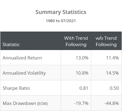
First, let’s look at how the strategy would have performed without the trend-following component. The orange line in the graph below represents our original test. The blue line represents the same strategy assuming that SPY/GLD are always in an uptrend.
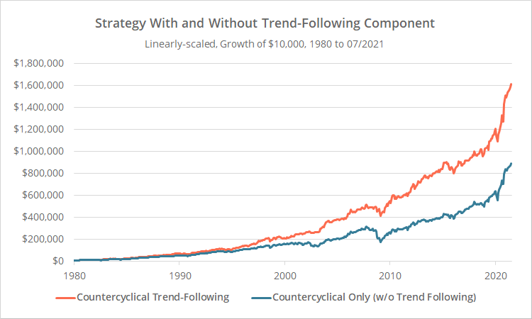
Linearly-scaled. Click for logarithmically-scaled chart.
Clearly, trend following is key to the effectiveness of the strategy, especially in terms of drawdown control. Without it, strategy performance would have declined significantly across all metrics.
How effective then is the economic component of the strategy?
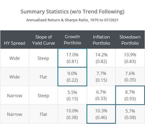
In the table below, we’ve shown how each of the three portfolios (growth, inflation and slowdown) would have performed in the month following each possible economic state. We’ve put a box around the portfolio that is intended to excel in that environment.
Note: (1) These results extend back to 1970, (2) ignore the trend-following component, and (3) unlike all other data in this post, do not include transaction costs.
Generally-speaking, each portfolio has excelled in its relevant economic environment. Results have mostly been stable over time (not shown for brevity).
The big exception is when the HY Spread is wide and the Slope of the Yield Curve is flat, when none of the portfolios have performed well. The addition of trend-following fixes much of that however.
Why our results will be less optimistic than the authors’:
As mentioned, we can’t say for sure that we’ve replicated the strategy precisely, but we do believe that we’ve captured the spirit of the strategy. When we use the same assumptions made by the authors we match their results very closely.
Even if we could replicate the rules precisely, we can say with certainty that our results would be more pessimistic than the authors (read: realistic). Why?
One reason is that we make conservative backtest assumptions, such as a reasonable allowance for transaction costs. The more significant reason however is due to how the authors estimate historical returns for US Small Cap Value (a major contributor to the strategy’s performance).
The authors appear to have used the French dataset (again, can’t say 100% due to lack of response). We’ve written an entire post on precisely this issue, so we won’t retread that ground here, but in a nutshell: in the case of Small Cap Value, that data doesn’t remotely match up to anything that can be traded via an ETF (or similar) in today’s market. It paints an overly optimistic picture. Read more.
The French dataset has value – especially for “this vs that” analysis such as value vs growth or small vs large caps. It is not appropriate however for these types of backtests where we’re saying here’s how small cap value would have performed historically.
We use the actual underlying indices that each ETF trades to estimate performance prior to ETF inception. All backtests involve a degree of uncertainty, but we clearly shouldn’t use data that we know to be wildly non-representative.
Outro:
This is a good strategy, and we appreciate the authors’ excellent research.
Our take on the strategy is the same as it was for Risk Premium Value. On the surface, the strategy hasn’t performed up to the level of many we track, but it may still be useful because it’s unique and offers a different take on the market from others that are based purely on price.
One closing thought:
In running this site over the last five years (wow, I can’t believe it’s already been five years), we’ve come to observe a consistent truth. The folks who are most successful in this business all share some common traits. They all:
- Welcome and encourage independent verification of their results.
- Understand a basic truth that, because TAA is designed to capture broad market movements, if your strategy falls down on slightly different backtest assumptions, the strategy probably wasn’t very good to begin with. TAA should be robust to small perturbations in testing.
- Also understand that having third parties like Allocate Smartly analyzing all of these disparate strategies on a level playing field benefits everyone. It increases trust in this style of investing as a whole.
We’ve worked with all sorts of developers. The vast majority understand and embrace those points. A handful don’t. Our hope is that by being able to draw a line between folks from the former group (Alpha Architect, Faber, etc.) and the financial success they enjoy in their businesses, the folks in the latter group will also come to do the same.
New here?
We invite you to become a member for about a $1 a day, or take our platform for a test drive with a free limited membership. Put the industry’s best tactical asset allocation strategies to the test, combine them into your own custom portfolio, and follow them in near real-time. Not a DIY investor? There’s also a managed solution. Learn more about what we do.
* * *
Calculation notes:
(1) Data sources: BofA US High Yield OAS after 12/1996. Prior to that, the difference between Moody’s BAA Corporate Bond Yield and the 10-year US Treasury CM Rate. BAA isn’t sub-investment grade, but the two approaches correlate well.
(2) Results do not include US Small Cap Value exposure (IWN) prior to 1990 due to a lack of accurate asset class data. Prior to this date, we replaced IWN with US Small Caps (IWM).
