This is quick explainer on linear vs logarithmic charts. We hope that even experienced users who are familiar with the subject will find a nugget or two of useful wisdom in here.
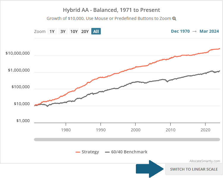
We provide all backtests in two flavors: linear and logarithmic (log). There’s a button below each chart where you can switch between them (see blue arrow in image below):
Linearly-scaled charts:
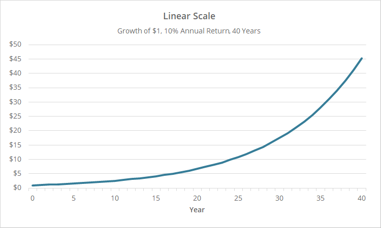
Below is a linear chart showing a hypothetical portfolio returning 10% a year for 40 years. This type of chart, showing investment performance, is called an “equity curve”.
Each evenly spaced horizontal line represents the same increase in dollar terms, i.e. $0, $5, $10, etc.
Note how the chart bends upwards. Even though the portfolio is returning a constant 10% annually, the growth of the portfolio accelerates over time due to compounding. This creates a distortion that makes it appear visually as if the portfolio became more effective over time, when it did not.
Logarithmic scaling corrects for this.
Logarithmically-scaled charts:
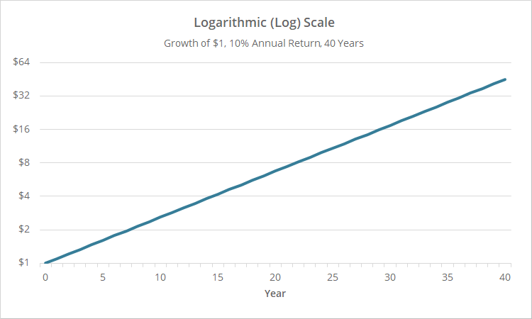
Below is a logarithmic (log) chart showing our same hypothetical portfolio returning 10% a year for 40 years.
Each evenly spaced horizontal line represents the same increase in percentage terms. An increase from $1 to $2 represents a 100% gain, as does an increase from $2 to $4, $4 to $8 and so on.
Importantly, our equity curve is now straight, better representing the consistent effectiveness of the portfolio over time, and negating the impact of compounding.
Linear scale distorts the sequence of returns:
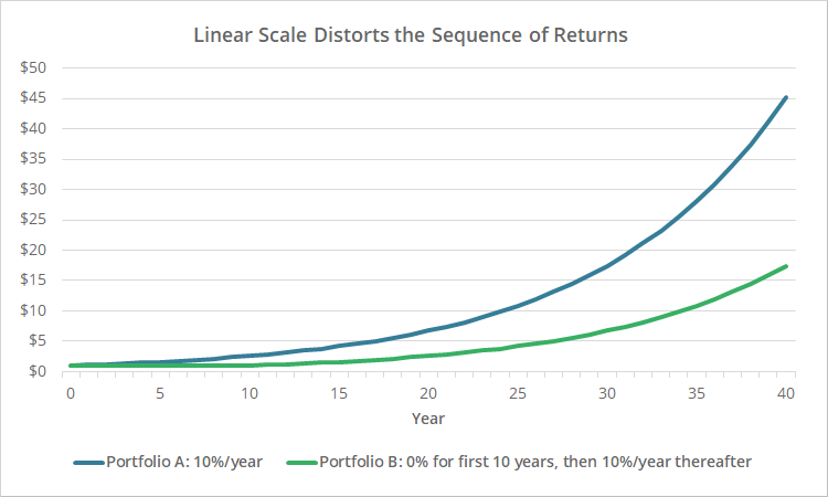
Another drawback of linearly scaled charts is that they distort the sequence of returns.
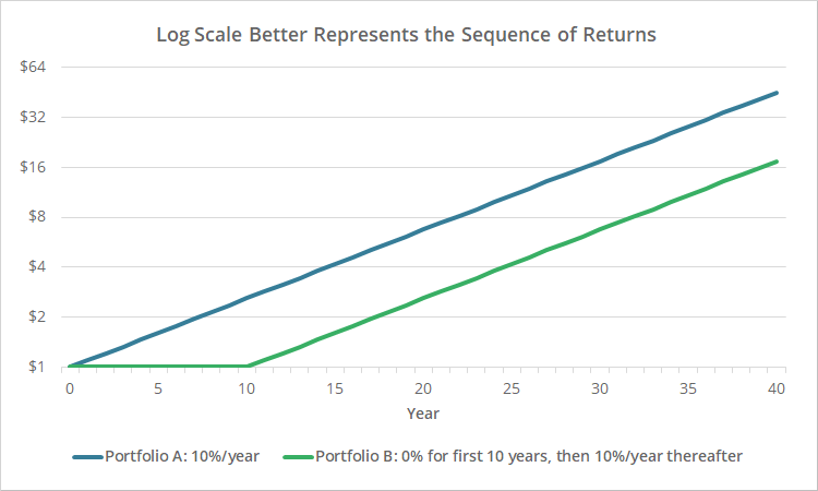
Consider the chart below. The blue line is our same 10% per year for 40 years portfolio. The green line represents a portfolio that returned nothing for years 1-10, but then returned 10% annually for the remaining 30 years.
Visually, the linear chart gives the impression that our blue portfolio has consistently outperformed the green portfolio since inception.
Let’s view the same chart logarithmically:
The true sequence of returns is now clear. The green line is flat for the first 10 years and then matches the blue line thereafter.
Linear scale distorts drawdowns, log scale minimizes drawdowns:
Yet another drawback of linearly scaled charts is that they distort the severity of drawdowns (i.e., “losses”). Recent drawdowns are exaggerated relative to distant drawdowns.
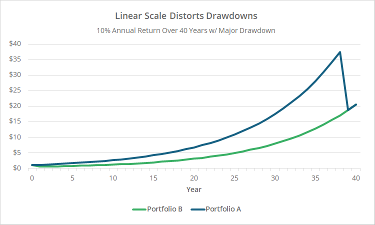
Consider the linear chart below. Both equity curves show our 10% per year portfolio, but the green portfolio experienced a 50% drawdown in year 1, while the blue portfolio experienced the same 50% drawdown in year 39.
The green line’s year 1 drawdown is effectively invisible, while the blue line’s identical drawdown in year 39 is very obvious.
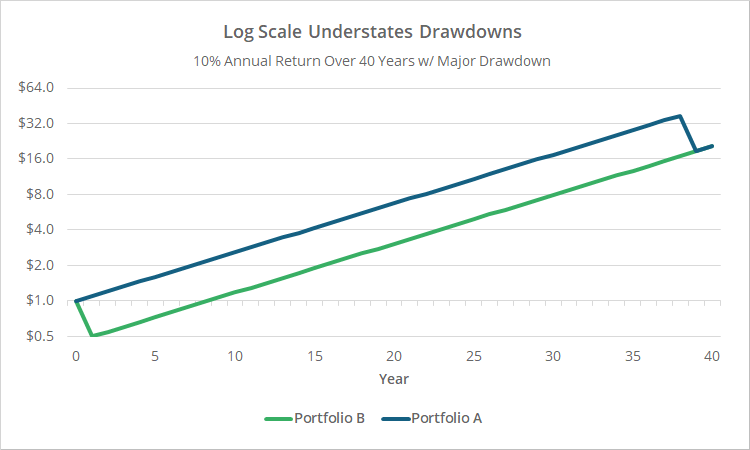
Logarithmic charts are better at representing drawdowns, but are still imperfect. Below are the same results scaled logarithmically:
The drawdowns are now equally bad. That’s good. The issue here though is that the severity of the drawdown is minimized visually. The portfolios both suffered massive 50% drawdowns, but that’s not clear from the chart.
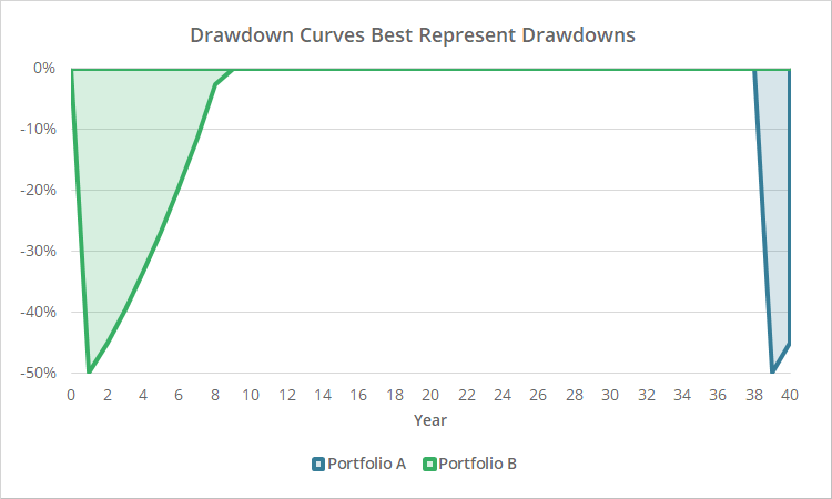
The solution to understanding historical drawdowns, is to ignore both linear and logarithmic equity curves, and instead refer to the drawdown curves we also provide with all backtests.
Below we’ve shown a drawdown curve for our two hypothetical portfolios. The timing and severity of the historical drawdowns is now much clearer:
Logarithmic charts are superior. So why do we default to linear charts?
We hope we’ve demonstrated that log charts are superior to linear charts for understanding historical performance (drawdowns aside). Why then, throughout this site, do we default to linear charts with the option to switch to log, and not the other way around?
Funny story.
We built this platform 7+ years ago with the site-wide default set to log scaling. On the weekend before we were to launch, our CTO, who is brilliant when it comes to technology but at the time was relatively inexperienced when it came to quantitative modelling, called me (me being Walter, the quant geek, whom many of you know).
He said, “I’m having a hard time understanding something on this chart. Explain logarithmic scaling to me one more time.” Mind you, this was after 10 months of intense coding where we had daily discussions about all manner of subjects far more intricate than this.
It was at that point that I realized that the purist in me was letting “perfection be the enemy of good”.
We want this platform to still be useful to investors who aren’t hardcore investment geeks. By requiring less experienced investors to understand the complexities of log scaling from the jump, we were adding an immediate barrier to initial entry.
So, we made a midnight hour decision to default to linear scaling with the option to switch to log.
We’d like to add the ability for users to set their own custom site-wide default. That’s on the development path for a future site upgrade.
New here?
We invite you to become a member for about a $1 a day, or take our platform for a test drive with a free membership. Put the industry’s best Tactical Asset Allocation strategies to the test, combine them into your own custom portfolio, and follow them in real-time. Learn more about what we do.
