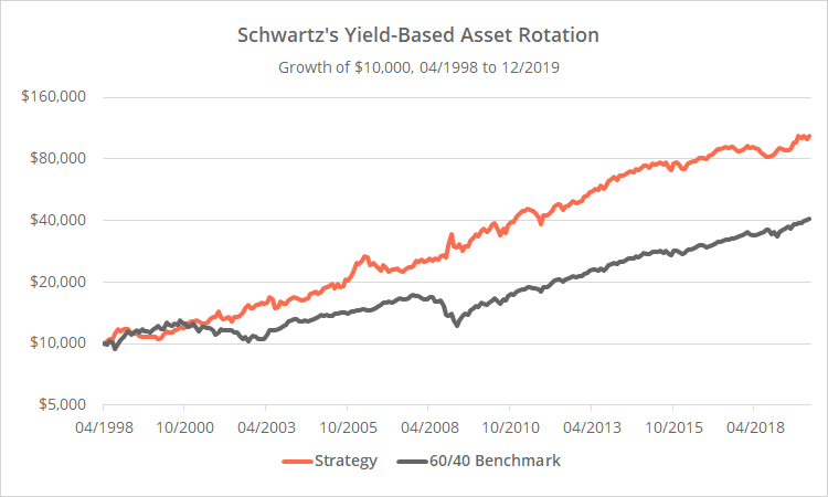
By reader request, this is a test of a tactical strategy from Harrison Schwartz that considers various economic yields in order to rotate among asset classes. Strategy results versus the 60/40 benchmark follow. We’ve extended Schwartz’s original test by an additional 6+ years, and accounted for transaction costs (see backtest assumptions).
Learn about what we do and follow 50+ asset allocation strategies like this one in near real-time.

Logarithmically-scaled. Click for linearly-scaled chart.
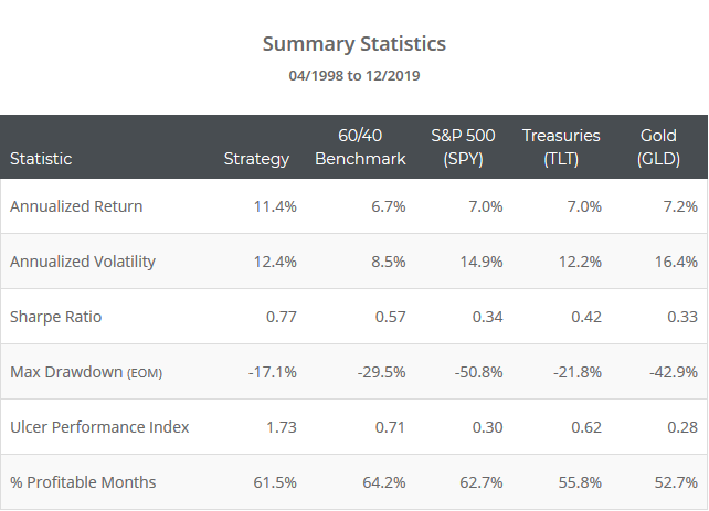
Summary statistics follow. For context we’ve also included each of the asset classes traded by the strategy. Note the outperformance across the board on both an absolute and risk-adjusted basis.
This test is considerably shorter than most you’ll find on our site. That’s a limitation of the economic data required by the strategy (see below). There is definitely some good in the concepts presented here, but for reasons we’ll cover in a moment, we won’t be tracking the strategy on an ongoing basis.
Strategy rules tested:
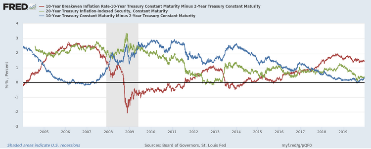
Consider three economic yields. Determine the highest of the three and buy the corresponding asset.
- Yield spread between 10-year and 2-year US Treasuries (T10Y2Y). Corresponding asset: US equities (SPY). Seen as a leading indicator of future economic growth/equity performance.
- Yield on 20-year TIPS (DFII20). Corresponding asset: Long-term US Treasuries (TLT). From the author: “The 20-year TIP rate is a simple measure of the long-term real cost of money. If that value is higher, then it implies that the market is pricing for economic inflation and for growth to be lower than the yield on those bonds.”
- Yield spread between the 10-year “breakeven inflation rate” and the spread between 10 and 2-year US Treasuries (see here). Corresponding asset: gold (GLD). From the author: “If the comparative value of inflation is less than the yield curve, as it is today, then you’re best off in gold or other inflationary assets.”
The three series are shown below (click for a dynamically updating chart from FRED). Again, we’re selecting the highest of the three. We assume that trades are executed at the close on the same day as the yield data. In practice this isn’t possible due to delays in data reporting. More on this in a moment.
A small “real world” spin on the strategy:
Two issues to consider:
- The data required by the strategy is not released in real-time. There is a delay in reporting.
- This strategy has switched position about four times per year on average, but most of those trades have come during brief periods when there was a battle back and forth for the top spot. We assume trading frictions (transaction costs + slippage) of 0.1% per trade, resulting in about an 0.79% drag on annualized return in our test.
We can respond to both concerns with a small modification to the strategy. For example, we could smooth each data point with a 5 day (1 week) moving average to reduce whipsaw, and then use the value from 3 days ago to account for delays in data reporting. Performance would have actually improved, and position changes would have dropped to just 1.6 per year.
I pulled those parameters out of the air and other reasonable values would have provided similar results. The point: This is a very long-term oriented strategy, and there’s no need to get too crazy about executing signals too quickly or too specifically.
Our take on this strategy:
Due to limited TIPS yield history, this test is pretty short by tactical asset allocation standards (21+ years). Over that period the strategy has done reasonably well at limiting losses during the worst periods of market stress (2000-02 and 2007-08). Although it only holds a single asset at any given time and as a result can be quite volatile, it has outperformed the 60/40 handily on both an absolute and risk-adjusted basis.
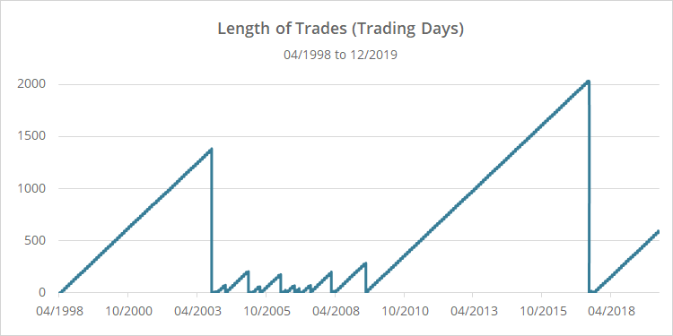
We think there’s one fly in the ointment however that’s not obvious from the performance results. Take a look at the chart below showing the amount of time the strategy was in each trade at any given point.

Note: Measures trading days, not calendar days.
Notice that the entire track record is mostly composed of just three trades, i.e. the three big spikes: Treasuries at the beginning of the test (1,382 days), equities (2,026 days) and then gold (543 days).
Those three trades make up 73% of the test. That means that we really don’t have 21 years to consider. We really have 5+ years to consider, plus three trades. In our view, that’s just not enough to judge the efficacy of something that trades so infrequently.
I think that the concepts presented here have value; they would just need to be interpreted in a different fashion to allow for more granular trades and more confidence that we’re actually on to something predictive.
Thank you to Harrison Schwartz for sharing this strategy and for the opportunity to put it to the test (and for making it so easy to replicate his results). Investors benefit from the free flow of novel ideas like this one, and we always appreciate when folks contribute to that collective discussion.
New here?
We invite you to become a member for about a $1 a day, or take our platform for a test drive with a free limited membership. Put the industry’s best tactical asset allocation strategies to the test, combine them into your own custom portfolio, and follow them in near real-time. Not a DIY investor? There’s also a managed solution. Learn more about what we do.
How we extended our TIPS data an additional 6+ years: 20-year TIPS constant-maturity yield data begins in 07/2004. We extended that series using an individual TIPS issue available on FRED DTP30A28. For the purpose of a slow-moving strategy like this one, it’s a reasonable approximation.


