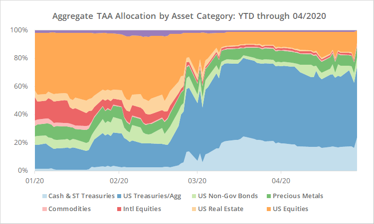
We track 50+ public Tactical Asset Allocation (TAA) strategies. A unique feature of our platform is that we show the aggregate allocation across all of those strategies each day (member link).
For example, the graph below shows the aggregate allocation year to date by category of asset. Note the increase in defensive allocation (ex. bonds) and decrease in risk allocation (ex. stocks) as the most recent crisis unfolded.
This Agg. Alloc. Report is not intended to be a timing tool. It’s simply meant to provide insight into what TAA as a trading style is saying about the market. But over the last couple of months we’ve been receiving a lot of questions about using it do just that: time the market in the short-term.
We suspect that’s because most of the strategies that we track trade just once per month (with the specific day(s) chosen by the member). That can be a long time to wait during a fast-moving market like this. The Agg. Alloc. Report provides daily feedback and that can be very tempting.
So, in this post we’re going to look at that question: How would the Agg. Alloc. Report have performed as a timing tool?
Test #1: Same Day Execution
We’ll start with the simplest approach: Take the aggregate allocation shown each day and trade it at the close. Just like we do on the report, we’ve broken results down by granularity. Did the investor trade the dozens of individual assets (orange), the 10 categories of assets (blue), or just risk on vs off (green).
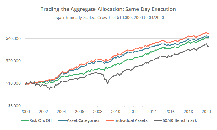
Logarithmically-scaled. Click for linearly-scaled chart.
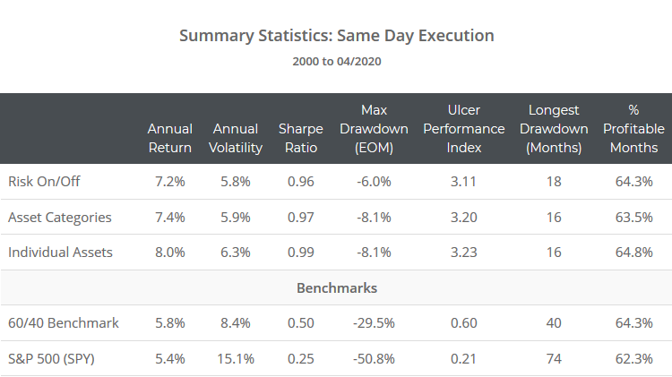
Click for combined summary stats across all tests.
Some brief calculation notes:
- These results begin in 2000 because we think members are really asking about performance during bear markets, and that covers two big ones. We can’t take these results as far back as we do other tests, and we don’t want the go-go 90’s to skew these results.
- Unlike other tests on our site, we’ve ignored transaction costs + slippage. Trading the agg. alloc. every day would entail some pretty hefty costs, but we don’t think anyone is asking about doing this on a regular basis, just during specific crisis points.
- For “categories” and “risk on/off” we’ve used a single asset to represent each. See end notes.
Observations:
- As one would expect, more granularity has meant better performance (individual assets > categories > risk on/off). In the real-world however, individual assets number in the dozens at any given time and that may not be practical, so it may be more useful to use categories.
- Less granular approaches exhibit less volatility and smaller max drawdowns. But from a risk-adjusted perspective (Sharpe and UPI), granularity still wins. The second bit is to be expected, but the first bit was surprising to us and we’re still processing the implications.
- The risk on/off test has outperformed the more granular approaches since the 2008 Global Financial Crisis. Our best guess is that’s a result of the two proxy assets we’re using (SPY and IEF) being particularly strong over that period.
- The chart demonstrates a truism about TAA: Just getting your risk right (the green line), is 80% of the battle. The green line is a mix of just two simple assets. Managing those correctly would have allowed investors to sidestep all significant bear markets in our test. Everything above and beyond that is just trying to marginally improve performance.
Test #2: Adding a 1-Day Lag
The problem with the results above is that they’re not possible on our platform. The Agg. Alloc. Report is generated nightly, and the test above assumed that an investor had perfect foresight of that night’s results.
So, in the results below we’ve added a 1-day lag to execution. In other words, an investor reviewed the Agg. Alloc. Report last night but didn’t execute until today’s close. The lightly colored lines represent our previous test (same day execution) and the dark lines add the 1-day lag.
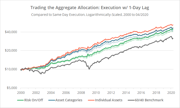
Logarithmically-scaled. Click for linearly-scaled chart.
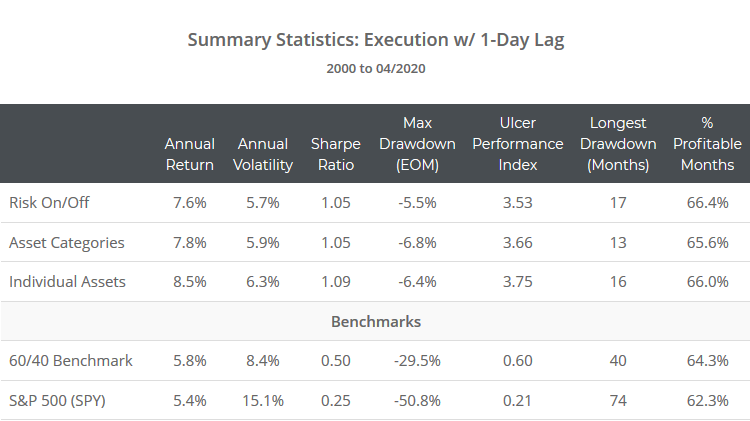
Click for combined summary stats across all tests.
All previous observations hold. We’ll add one additional from these results: Across all metrics, adding a 1-day lag would have improved performance. There are two reasons for that:
- TAA is usually geared around some flavor of momentum. That means TAA tends to increase (decrease) allocation when asset prices increase (decrease). Many of these assets had a tendency to mean-revert in the very short-term, especially during the early 2000’s. So, by delaying execution by a day, we were often buying (selling) at a lower (higher) price.
- Allocations tend not to make huge swings day-to-day. TAA is designed to take advantage of broad market trends and ignore day-to-day noise, so today’s agg. alloc. is usually a pretty good estimate of tomorrow’s.
Transaction costs and slippage aside, these results could actually be executed in the real-world. Because we know readers will ask: alternative approaches like adding even more lag or using the previous n-day average didn’t bear fruit. The 1-day lag appears to be the sweet spot.
So far so good. The real question though is how these results compare to monthly execution (i.e. the way TAA is usually traded).
Test #3: Month-End Execution
In the chart below we’ve tested only executing the agg. alloc. at the close on the last trading day of each month. This is how most of these strategies are designed to trade. The lightly colored lines represent our previous test (1-day lag) and the dark lines our current test (month-end execution).

Logarithmically-scaled. Click for linearly-scaled chart.
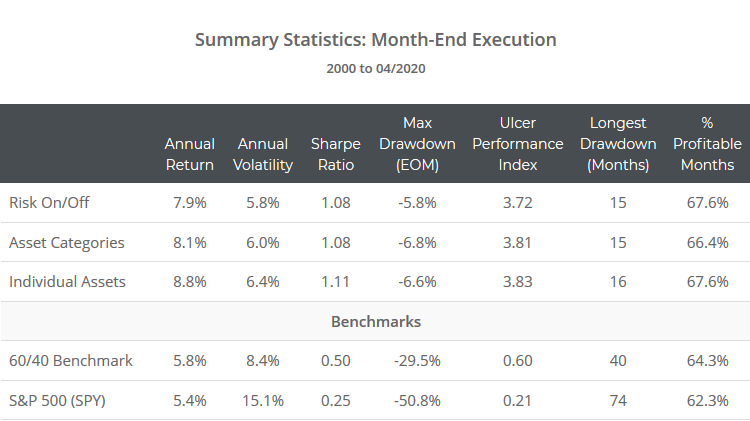
Click for combined summary stats across all tests.
All previous observations hold. Month-end execution outperformed, but not by a significant margin. Remember though, these results do not include trading frictions. Had they been factored in, that margin would have been greater.
What can we conclude from these results?
The Agg. Alloc. Report could be useful as a daily guide during crises (with a 1-day lag). There hasn’t been a significant advantage to doing so, but there hasn’t been a disadvantage either (but transaction costs + slippage would be a factor, so this is at best a short-term case-by-case solution).
Other observations:
- The Agg. Alloc. Report includes all strategies. If you believe that you can distinguish good strategies from not-as-good strategies, then the report might not be a good resource because it’s exposed to everything on the site.
- These results do not apply to individual strategies. For individual strategies, the difference between today and tomorrow’s allocation could be extreme, as would the risk of getting whipsawed to death. This approach only works if you’ve combined enough strategies to cancel out much of that short-term variability.
A word of warning:
For this approach to work, it would have to be done systematically.
If you only referred to the Agg. Alloc. Report once you reached your “uncle point” and then used it to justify your next step, that would be very different than what we’ve tested here. You would have to start early in the crisis and then continue doing so throughout to achieve anything like these results.
In other words, the report has value on a daily basis, but it also provides ample opportunity for investors to justify their preconceived beliefs at the worst possible moment. User beware.
Combined summary stats for all tests follow:
How does “portfolio tranching” fit into this?
Another unique feature of our platform is the ability to “tranche” monthly strategies. Rather than selecting a single day of the month to trade, you can spread execution across multiple days. That could be minimal like 2 tranches, with each half of the portfolio trading at a different point in the month, or it could be extreme like daily tranching, with roughly 5% of the portfolio trading every day.
That’s very different than what we’ve tested here. Here we’ve tested a much more aggressive approach trading (potentially) 100% of the portfolio every day.
This aggressive approach is obviously going to make the portfolio much more responsive to change. The concern when we began this analysis was whether that would make the portfolio too responsive, leading to more frequent whipsaws.
Based on this analysis it doesn’t, but again, we’ve made a huge simplifying assumption that trades incurred no transaction costs + slippage. Had we included them these results would have been quite different, meaning this at best a short-term solution during crisis points.
Further research:
The results in test #2 showing the benefit of next day over same day execution raises some interesting questions. We’ve looked at next day execution on an ad hoc basis, but never site-wide. Expect more research on this posted in the coming month.
Conclusion:
We sprinkled a ton of conclusions throughout this piece and we don’t want to retread all those here.
In a nutshell, the daily aggregate allocation across the site has value as a timing tool, but it may be of limited value relative to good ol’ fashion monthly timing. As always, caveats abound.
New here?
We invite you to become a member for about a $1 a day, or take our platform for a test drive with a free limited membership. Put the industry’s best tactical asset allocation strategies to the test, combine them into your own custom portfolio, and follow them in near real-time. Not a DIY investor? There’s also a managed solution. Learn more about what we do.
Calculation notes:
For the Risk On/Off analysis: All equity, real estate and high yield bond assets are categorized as risk on, and all other assets as risk off. Risk on is represented by a single proxy asset SPY and risk off by IEF.
For the asset category analysis: All assets are grouped into categories, and each category represented by a single proxy asset as follows: US equities (SPY), US real estate (VNQ), US gov bonds (IEF), US non-gov bonds (LQD), intl equities (EFA), intl real estate (RWX), intl bonds (BWX), previous metals (GLD), commodities (DBC) and cash.
