Sources of long-term historical data are few and far between. Because it’s been generously provided for free, one of the most often used is data from Professor French (of Fama-French fame). Others include Shiller and Ibbotson.
These datasets are fine for a first pass at testing out ideas, but they often don’t remotely match up to something that can actually be traded in today’s market. Before you commit money to an idea, it’s crucial that you test it out using either actual tradeable assets or highly similar proxies.
To illustrate the danger of backtesting with unrealistic data, below we’ve replicated a paper that previously won the prestigious Charles H. Dow award (*). We’ll begin by testing the strategy as the authors did, using French’s data from 1926. Unlike other tests on this site, transaction costs have been excluded, because we don’t want to confuse the point we’re trying to make.
This is a simple relative strength strategy:
Go long Utilities at the close of the week if the 4-week return of the Utilities sector is greater than the 4-week return of the market, otherwise go long the market. Rinse and repeat weekly. Utilities are a defensive asset relative to the broader market, and in theory, this strategy demonstrates the utility sector’s prowess as a leading risk on/risk off indicator.
So far so good. Our strategy has return 13.4% annualized, versus 9.9% for the market and 5.6% for the opposite strategy. Where do I sign up?
Testing with a tradeable asset: XLU
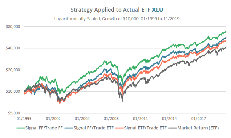
Before we commit hard earned capital, let’s compare our result to one based on assets that are actually tradeable. We’ll use the largest ETFs available to represent both utilities and the total stock market, XLU and VTI, in 3 variations:
- Green: Generate our signal based on French’s data and then trade French’s data, as done in the original paper. You can’t actually buy a French sector, so this is purely hypothetical.
- Blue: Generate our signal based on French’s data, but trade the ETFs XLU and VTI. Because French’s data is delayed, this isn’t actually possible either, but for the sake of completeness we’ve included it.
- Orange: Generate our signal based on the ETFs and trade the ETFs. This is likely how one would actually execute the strategy.
This test is much shorter than the original because XLU launched in 12/1998.
Note the difference between the orange and green lines. Our once predictive strategy looks essentially random when we substitute in tradeable assets.
The authors also ran a test on XLU, but they didn’t compare French and ETF results side-by-side over an overlapping period. Had they done so, we might have concluded that the hypothetical French results were not a very good representation of reality. And if we can’t trust them from 1999 onwards, then we probably can’t trust them from 1926 onwards either.
Testing with a tradeable asset, take 2: VPU
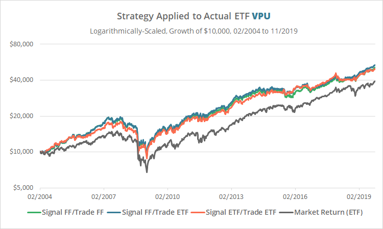
Maybe we’re jumping the gun. Perhaps the problem is specific to XLU. Let’s try our test again, this time using the second largest ETF available to represent utilities, VPU. Our test will be even shorter this time due to VPU’s shorter history.
These results line up nicely. One might be led to think then that the problem is specific to XLU. Unfortunately, that isn’t the case.
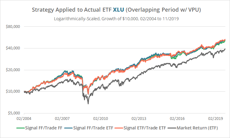
Let’s run our test with XLU again, this time using the same shorter time period used in our VPU test.
We see essentially the same result as when trading with VPU. That means that in this shorter test from 2004 the strategy “worked” because of the narrow slice of time tested, not because VPU is more predictive. XLU and VPU have both performed near identically.
Which test is the right test?
So now the question becomes, is the narrower slice of time covered by VPU more indicative of the actual long-term performance of the strategy (i.e. the strategy is good), or is the slightly longer slice of time covered by XLU more indicative (i.e. the strategy is not good)?
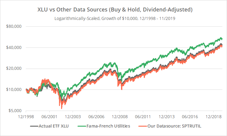
To answer that question, we’ll make use of our own simulated data to extend our backtest. Ours is a better proxy for XLU’s actual performance because it’s the same underlying index that XLU tracks (Bloomberg: SPTRUTIL). To illustrate that better fit, below we’ve graphed the asset returns of XLU (grey) versus French’s data (green) and our own data source (orange). This is not a strategy, we’re simply buying and holding.
A cursory examination shows that SPTRUTIL, while imperfect, has been a significantly more accurate proxy. That makes sense given that it’s the same underlying index that XLU tracks.
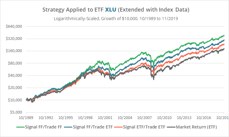
So, to answer the question once and for all, does this strategy actually work, we’ll run our test one more time. This time we’ll use our improved historical data source prior to XLU’s launch and XLU thereafter. This will allow us to produce a reasonably accurate result from 10/1989 onwards.
Calculation note: We extended VTI with the index RU30INTR due to the short history of CRSPTMT, but that’s not a big factor because French’s data does a reasonable job at replicating the “market” return.
Note the stark contrast between the green line (French data) and the orange line (our data). More importantly, note that the orange line has essentially performed in line with the market return. Had this test included trading frictions (transaction costs + slippage), the strategy would have significantly underperformed. There is no consistent edge to be found in this 30-year test.
It’s part of our nerd nature to always undersell our analysis, but I think we can safely conclude the following:
- Is it possible that an edge existed in the distant past? Sure, we haven’t tested for that here, although it’s not a relevant question to today’s market.
- Is it possible that a weak edge existed in our 30-year test, but it was hidden by imperfections in SPTRUTIL, et al.? Absolutely.
- But is that edge anywhere near as strong as the original test would indicate? Almost certainly not. When tested over data we know to be a better proxy, the edge deteriorates significantly.
Outro
I would guess that 9 out of 10 strategies that we test don’t make it on to this site. One of the reasons for that is the issue we’ve described here: the strategy doesn’t stand up when tested on good data. We’re not picking on this specific strategy because we could cite many, many (many) other examples.
The key takeaway is simply to be more cynical about backtested results. Understand the authors’ source of historical asset data, as well as the backtest assumptions made (ex. transaction costs). Don’t even consider deploying capital until you’ve seen a reasonably accurate backtest, using quality data and realistic backtest assumptions.
New here?
We invite you to become a member for about a $1 a day, or take our platform for a test drive with a free limited membership. Put the industry’s best tactical asset allocation strategies to the test, combine them into your own custom portfolio, and follow them in near real-time. Not a DIY investor? There’s also a managed solution. Learn more about what we do.
(*) We’ve withheld the title of the paper. This issue of data quality is an important topic to discuss, but we have no interest in bruising anyone’s ego. We aim to only spread good cheer.
Edit: One more comment for the data nerds. After thinking about this some more, we went back and tested the “opposite strategy” (go long XLU when VTI outperforms, and vice-versa) on our more accurate dataset. You could definitely conclude that the strategy is vastly superior to the opposite strategy. But that really isn’t the question. The question is whether the strategy is better than doing nothing and holding the market. And to that question, the conclusion in this post holds.

