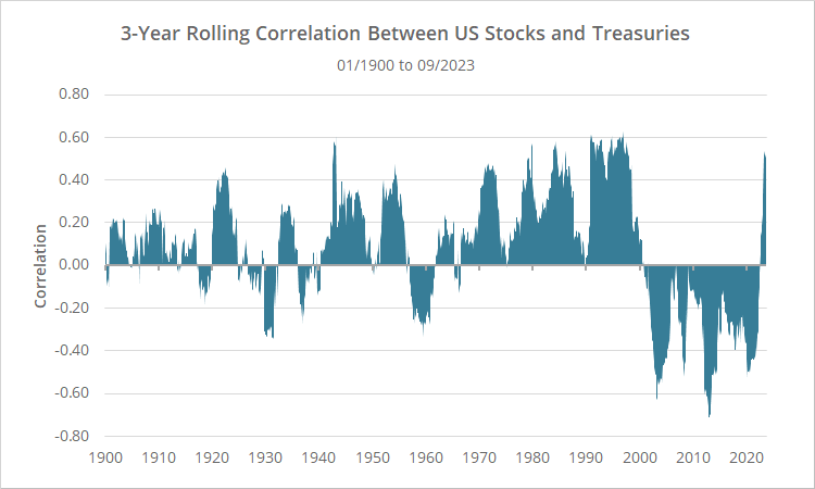
There has been a surge in correlation between US stocks and Treasuries over the last couple of years. To illustrate, below we’ve shown the rolling 3-year correlation between US stocks and 10-year Treasuries since 1900 (based on monthly returns). Note the spike at the far right of the chart.
What is correlation? In this context, it measures the strength of the relationship between US stocks and Treasuries. Results could range from -1 (perfect inverse relationship) to +1 (perfect positive relationship).
Two key takeaways:
- A slightly positive correlation is the norm. Correlation was positive in 60% of all 3-year periods, with an average correlation of +0.085.
- Neither the negative correlation enjoyed for most of the 2000’s, nor the strong positive correlation we’re experiencing now, are the norm (but are also not unheard of).
Why is this important?
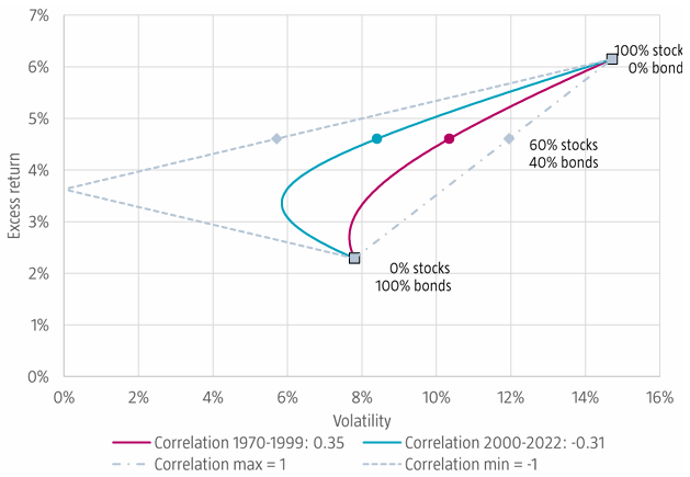
Stocks and bonds (particularly government bonds) are the cornerstone of a diversified portfolio. When trading a diversified portfolio, lower correlations allow us to (theoretically) enjoy lower risk for a given level of return, or conversely, higher returns at a given level of risk.
The following chart (from Molenaar, et al.) illustrates how the hypothetical efficient frontier of a buy & hold portfolio changes as the correlation between stocks and Treasuries changes.
From a Tactical Asset Allocation perspective (the type of trading we focus on), lower correlations help to ensure that Treasuries will act as a proper defensive asset when they’re called upon to do so. During the 2022 bear market, a surge in correlation meant both stocks and Treasuries fell in unison to a degree not seen in nearly 100 years.
In short: negative correlation is great, but not required – a weak positive correlation is okay too – but strong positive correlation is terrible.
Inflation as a predictor of stock/treasury correlation:
We’ve been exploring two recent papers from AQR and Molenaar, et al. that study the impact of inflation on stock/treasury correlation. To oversimplify: high inflation and/or very volatile inflation (like we’ve seen over the last couple of years) tends to lead to higher stock/treasury correlations.
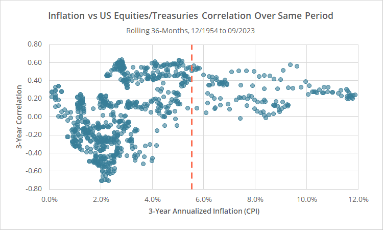
In the scatterplot below we’ve shown rolling 3-year annualized inflation (CPI) since 12/1954, versus the correlation between stocks and Treasuries over the same period. The orange line represents inflation over the most recent 3 years (5.6% annualized).
Note how stock/treasury correlation has been consistently positive when inflation is above the 4.5%-5.0% range.
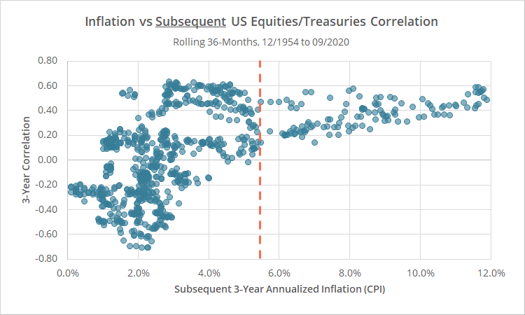
The effect has been even stronger when inflation is used as a predictor of future correlation. Below is the same chart, this time showing 3-year annualized inflation (CPI), versus the correlation between stocks and Treasuries over the subsequent 3-years.
Geek note: We’re following the lead of Molenaar, et al. and only considering data from 01/1952 onwards, roughly the start of when the Fed began following a deliberate countercyclical policy.
The aforementioned papers provide a lengthy discussion about the fundamental reasons that inflation and stock/treasury correlation could be linked, and we encourage interested readers to refer to those papers for more info.
How is this observation practically useful?
We’ve provided simple data here, but we spent a fair bit of time offline diving deeper into this observation, including replicating the specific approaches taken by the authors. We were trying to determine if this inflation observation could be useful in a tactical context for tweaking allocations based on whether stock/treasury correlation is predicted to be high or low.
We came to the conclusion that it was not sufficiently predictive. It’s definitely an interesting data point for polite dinner conversation, but we don’t see it as useful for adjusting portfolios in real-time.
Two reasons:
- First, as shown in the scatterplots above, even when inflation is under control, stock/treasury correlation is very often still high. That means that we have to assume high correlation is a possibility at all times.
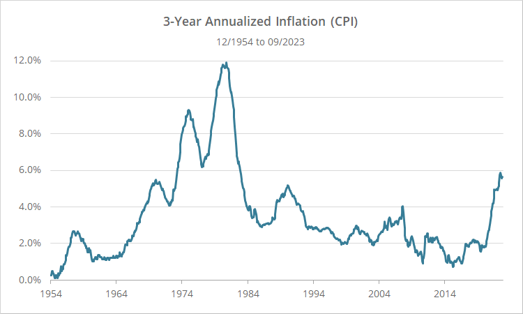
- Second, we’re still not entirely convinced that this observation isn’t a product of unintentional overfitting. Looking at rolling 3-year annualized inflation (CPI) since 1954, there are just a handful of “eras” where inflation was above that magical 4.5%-5.0% threshold: from the late 1960’s to the mid-80’s, briefly in the early 1990’s, and most recently.
When talking about very long-term observations like this one, if those observations are limited to a handful of distinct eras like we see here, it’s very easy to get fooled by the natural (and unrelated) long-term ebbs and flows of the market.
Having said all of that, we didn’t want all the time we put into looking at this observation to go completely to waste and thought it was at least worth a share.
New here?
We invite you to become a member for about a $1 a day, or take our platform for a test drive with a free membership. Put the industry’s best Tactical Asset Allocation strategies to the test, combine them into your own custom portfolio, and follow them in real-time. Learn more about what we do.
