Thinking about this chart from John Hussman, showing margin debt relative to GDP spiking to all-time highs, with previous such instances seeming to foreshadow major market downturns:
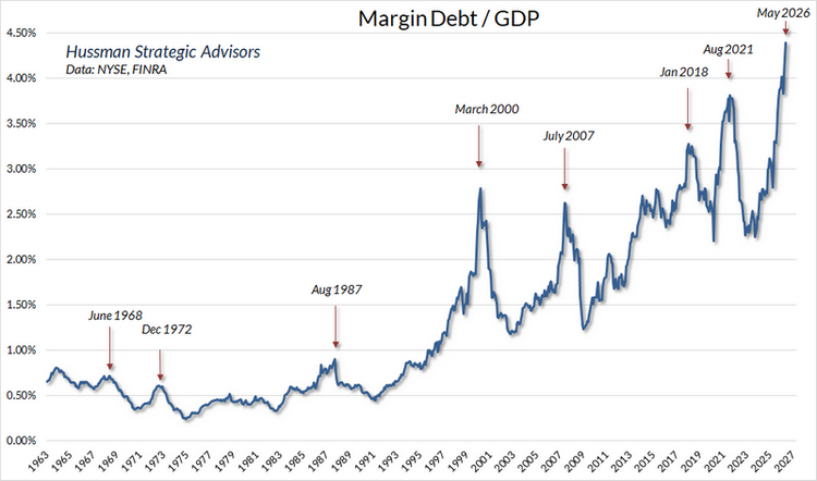
It’s very easy to look at a chart like this with hindsight and identify the top of each spike. It’s much more difficult to do that in real-time. That’s doubly true because of the big shift in the data in the early 1990’s. Pretending like you would have seen the pre-1990 instances as spikes in real-time, or not seen the entire 1990’s as a spike, is a little silly.
Below we present the data a bit differently. Here we show the 12-month difference in Margin/GDP (*).
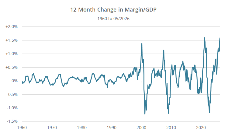
The three big spikes in 2000, 2007, 2021 and today now stand out clearly. All spikes prior pale in comparison.
How has the market performed following these spikes? Below we show S&P 500 returns (annualized) after the change in Margin/GDP spiked above 1% (first instance only, overlapping observations ignored).
| S&P 500 Annualized Return Following Spikes in Margin Debt/GDP |
|||
|---|---|---|---|
| Date | 12m Return | 18m Ann. Return | 24m Ann. Return |
| 01/31/2000 | -0.8% | -7.9% | -8.9% |
| 06/29/2007 | -13.2% | -27.3% | -20.0% |
| 01/29/2021 | 23.2% | 8.9% | 6.4% |
| 09/30/2025 | ? | ? | ? |
| Average (Geo) | 2.0% | -10.0% | -8.1% |
Returns following the spikes in 2000 and 2007 were poor, but 2021 bucked the trend.
Perhaps a better criterion is a spike of more than 1% followed by a decline of any amount, to try to time the top. Those results look as follows:
| S&P 500 Annualized Return Following Spikes + Decline in Margin Debt/GDP |
|||
|---|---|---|---|
| Date | 12m Return | 18m Ann. Return | 24m Ann. Return |
| 4/28/2000 | -11.8% | -18.1% | -12.8% |
| 8/31/2007 | -11.0% | -35.5% | -14.7% |
| 4/30/2021 | 0.0% | -3.7% | 1.3% |
| 11/28/2025 | ? | ? | ? |
| Average (Geo) | -7.7% | -20.1% | -9.0% |
These results are more uniformly negative, especially around the 18-month mark.
What does all this mean?
These results are bearish, but they don’t mean much in isolation. It’s dinner conversation (at a very boring dinner where we talk about market valuations).
At most, it’s another warning light indicating that the market is overvalued. Add it to the giant pile of other indicators warning that this market is too rich.
If that’s the case, what do we do about that now, today?
Nothing. The market can remain overvalued for years. We stay the course and take advantage of the current market trend until we see concrete signs of weakness.
Trying to precisely time market tops ahead of time is a fool’s errand.
New here?
We invite you to become a member for about a $1 a day, or take our platform for a test drive with a free limited membership. Put the industry’s best tactical asset allocation strategies to the test, combine them into your own custom portfolio, and follow them in near real-time. Not a DIY investor? There’s also a managed solution. Learn more about what we do.

(*) Calcuation notes:
(1) Calculated as margin debt today minus margin debt 12m prior, all divided by average monthly GDP over same period.
(2) As mentioned, there was a big shift in Margin Debt/GDP in the early 1990’s. In real-time, without the benefit of hindsight, we would have analyzed this data differently than we have here. A change of say +/- 0.25% may have appeared significant in the mid-1990’s, whereas now we’ve set our threshold at 4 times that. Our point is: take all of this with a grain of salt. Markets change and the nature of this metric may very well change over time as well.