This is the fourth installment in our series on selecting Tactical Asset Allocation (TAA) strategies based on recent performance. Read parts 1, 2 and 3.
In our previous studies we selected strategies based on recent return. In this study, we select “distressed” strategies, or strategies nearing or exceeding their previous max drawdown.
We looked at this subject way back in 2020 and concluded that strategies tended to generate higher returns when distressed than on other days. That still holds true today, but there’s another piece to the puzzle. In short, it doesn’t make sense to select a strategy simply because it’s near a previous max drawdown (nor does it necessarily make sense to avoid it).
Note: We track 100+ strategies, making these findings broadly representative of TAA as a trading style.
Results from 1990 (*):
We advocate combining multiple strategies together into “Model Portfolios” to limit the risk of any single strategy underperforming. We’ve assumed the investor selected strategies for their portfolio at the end of each month by looking at the “distance to max drawdown” for all 100+ strategies.
For example, if a strategy’s previous max drawdown was -10% and current drawdown is -5%, the distance to max drawdown = 50%. We assume the investor only knew about drawdowns up to that moment in time (no lookahead bias).
The investor divided the portfolio into Y equally-weighted slots (from 1 to 5) and selected the Y strategies closest to their previous drawdown if the distance was >= X% (50-100%).
Important: Any slots not filled by a distressed strategy earned the average strategy’s return the following month. In most months, no strategies meet our criteria. We want to evaluate whether distressed strategies outperform other competing strategies when they do appear.
We’ll show results for our hypothetical portfolios across four metrics, starting with annualized return. For comparison, we also include the average strategy we track, as well as the 60/40 benchmark (*).
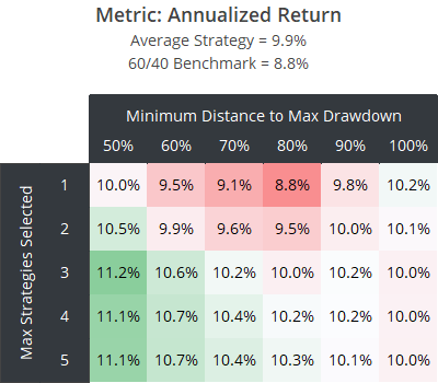
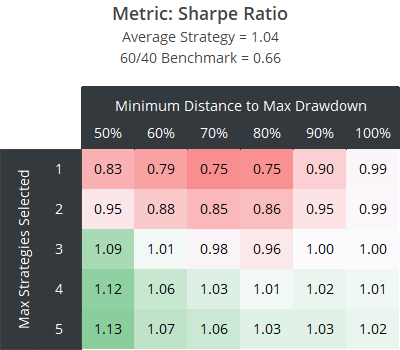
There has been a small benefit to this approach when the number of slots in our Model Portfolio is large enough to still provide some diversification (3+), and the minimum distance to max drawdown is low enough (i.e. the bottom left of the table).
If we set our minimum distance to max drawdown too high, there simply aren’t enough strategies that meet our criteria to move the needle.
Next, we look at two measures of loss: Max Drawdown and the Ulcer Performance Index (UPI). Max Drawdown is of limited value; it’s capturing a single moment in time. UPI is our preferred measure because it considers return relative to both the depth and length of all drawdowns.
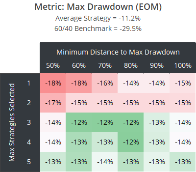
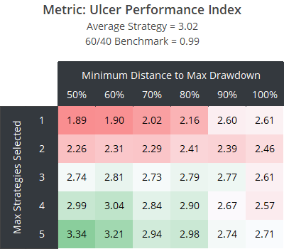
These results are basically in line with annual return and the Sharpe Ratio. There has been some benefit to this approach near the bottom left of the table, but that benefit has been small.
A mea culpa, sort of…
Again, we looked at this subject back in 2020 and concluded that strategies tended to generate a higher return when distressed than on other days. We’ve more than doubled the number of strategies in our test since then, but that basic observation still holds. However, we missed a piece of the puzzle in that previous analysis.
We were looking at the question at a strategy level; i.e. how has this strategy performed when distressed versus this strategy on all other months? In our analysis today we’re looking at the question at a portfolio level, and at a portfolio level there are two additional considerations.
The first is more obvious: distressed strategies tend to “cluster”. On most days there are few or no distressed strategies, and then suddenly market volatility spikes and many strategies simultaneously meet the criteria (think 2022, 2007-08, etc.) At a strategy level that doesn’t matter – every instance is treated equally – but at a portfolio level it does – individual strategy performance is diluted.
The second consideration is really the important one though, and it came as a big surprise to us (although in hindsight it makes sense).
When at least one strategy is distressed, all strategies tend to perform better the following month. For example, when at least one strategy was within 70% of its previous max drawdown, the average return of all strategies the following month was about 50% higher than other months.
The more distressed that single strategy is, the better all strategies perform. Likewise, the more strategies that are distressed, the better all strategies perform.
What voodoo is this?
We tend to see one or more strategies approach their previous max drawdown during spikes in market volatility. Concurrently, all strategies – including non-distressed ones – tend to generate higher returns during those same spikes in volatility.
Put another way, most of the higher return observed when strategies are distressed is not specific to the distressed strategy, it’s across all strategies.
Where does that leave us?
Should investors invest in distressed strategies? There is limited evidence for that. It’s not the worst approach assuming the portfolio is reasonably diversified, but it’s not a great approach either. Our advice for selecting strategies remains the same:
Select a broad range of diverse, robust, high-quality strategies based on long-term performance. Consider avoiding strategies that have consistently failed to live up to expectations until performance is better understood (refer to the Underperformer Watchlist), but beyond those extreme cases, do not consider recent performance in strategy selection.
As mentioned, this is the fourth article in this series. Be on the lookout for additional tests in search of an effective approach for selecting strategies based on recent performance.
New here?
We invite you to become a member for about a $1 a day, or take our platform for a test drive with a free limited membership. Put the industry’s best tactical asset allocation strategies to the test, combine them into your own custom portfolio, and follow them in near real-time. Not a DIY investor? There’s also a managed solution. Learn more about what we do.

(*) Calculation notes:
(1) This analysis is shorter than in the three previous installments in this series. That’s because we use the first 20 years of backtested data for each strategy to find the max drawdown up to that point in time. The earliest any of the strategies on our platform begins is 1970, hence this analysis begins in 1990.
(2) A reminder from our previous analyses: These results account for trading frictions (transaction costs + slippage) in the individual strategy backtests, but do not account for the additional friction of switching between strategies. That means that the actual results of taking such an active approach to selecting strategies would have been worse than what we’ve presented here.
(3) All data as of 04/30/2026.